You are here
Why the Graphics in Your Eblast are Not Displaying
In order for a Graphic to display in an email, you need to have the EXACT ADDRESS of the image. If your image link is not working, it can be due to a number of factors. Before you send, be sure to follow the instructions on this page to view your HTML email before you send it.
For example:
- Using the webpage address will result in a message that the inserted image does not exist and to use a different URL. The image URL used to reference the desired image must be for that single image and not for the entire webpage it is hosted on.
- If you have copied and pased text from a web page, an image added by using an image URL can display a red X because the URL being used is not the for that image or the entire image URL was not copied.
Designing and coding for email is hard enough just when you’re dealing with all the quirks that desktop computers and webmail clients toss your way. Introducing mobile into the mix can add a lot of time and frustration, but it’s also helpful to know where images will be blocked and where preview text is supported.
| Operating System | HTML | Images |
Preview Text |
Alt Text | Scale |
Modify Fonts |
| Blackberry | O | O |  |
 |
 |
 |
| iOS 4.X |  |
 |
 |
-- |  |
 |
| Windows Phone 7 |  |
 |
 |
 |
 |
 |
| Anderoid |  |
 |
 |
 |
 |
 |
HTML:This column shows native HTML support on the device. Almost All most modern mobile operating systems support HTML and CSS, some even better than desktop clients! The days of worrying if your subscribers will receive a garbled text-and-code mash on their Blackberry are mostly over. As long as your recipients aren’t reading on a Blackberry that’s more than a couple years old, they’re most likely receiving either the text part of your message, or the HTML version if they’ve enabled the option on Blackberry 4.5+.
Images: While HTML support in mobile is mostly good news, the bad news is that image blocking is back in a big way. The only mobile OS that doesn’t block images by default is the iPhone/iPad. Of those devices that block images, most offer a big an easy way to turn them on. Images must, however, have the fully qualified url location for them to function.
Alt Text: Alt Text display a text description of an image if the image is not displaying (due to size or other constraints). Unfortunately, only Android will display alt-text behind a blocked image.
Preview Text: Preview text shows up right after the subject line, and pulls in the first few lines of live text from your email to give readers a “snippet” of what’s in the email. It’s a great way to pack more punch in your email, and it will show up in iOS devices as well as Windows Mobile 7.
Scale: While the iPhone zooms into your email and fits the email to the width of your screen, most other devices will display the upper left-hand corner of your email, leaving users to scroll left-and-right in addition to up-and-down to view your entire message.
Modify Fonts: Reading email on a tiny screen is hard. Every mobile OS will modify your fonts to some degree. iPhone and iPad have a 13px minimum font size and will auto-adjust anything under that size, often breaking navigation bars and other tiny text. In other devices, text can be condensed, breaking at random intervals and other unfriendly behaviors, but nothing that seemed consistent or predictable. The best course of action is to plan for unruly text behavior in your design, and learn to accept that your fonts may not be the size or shape you intended.
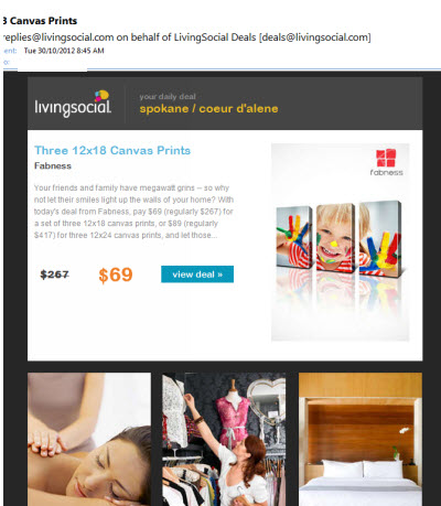
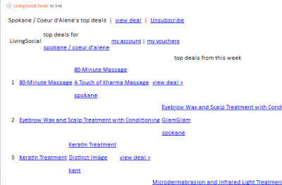
The below images show how the same email is displayed. The left is from Microsoft Outlook and the Right is from a Blackberry
 |
 |
If you are designing e-blasts to be read on mobile devices, you may want to consider the following for Text:
- Text-only messages, on average, yield a higher click-through rate than HTML emails.
- The email will render properly and the links will function as intended.
- You may wnat to create a new list of contacts that you know receive their emails on their phone.
For HTML:
- Keep the email simple, get to the point quickly, and make sure your brand is immediately recognizable.
- Make sure your subject line is clear and short. That may be your only opportunity to capture your mobile subscriber audience.
- Think about the screen size. Screens on a handheld are often small, so remember that you are working with a small space and a limited time to capture attention.
- Know your audience. For example, knowing what portion of your list reads their emails on a mobile device will be helpful in creating your content.
- Add a link to view as a web page.
