Main menu
You are here
Hiding/highlighting data on a legend
Some of the charts will have legends on them. When you see those, you can:
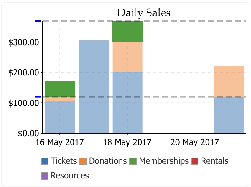
- run your mouse over the legend item to get a sense of where the data falls, with maximum and minimum. In the exanple below, the cursor is over the 'Memberships' item and it shows the relative range of data on the graph.
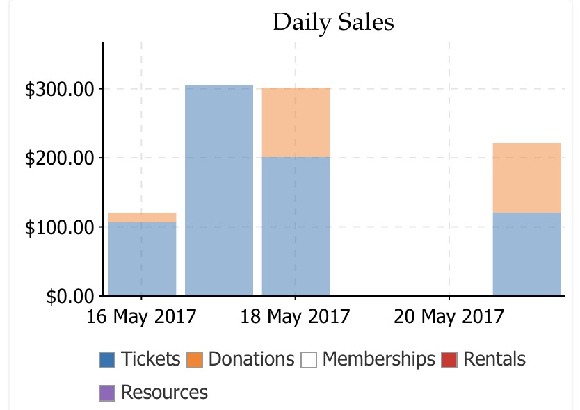
- Hide or show specific data on the chart. In this case, 'memberships' was clicked and all data pertaining to memberships is no longer shown on the chart. You can hide or show as many items on the graph as you want -- if you just want to see totals of some specific items.
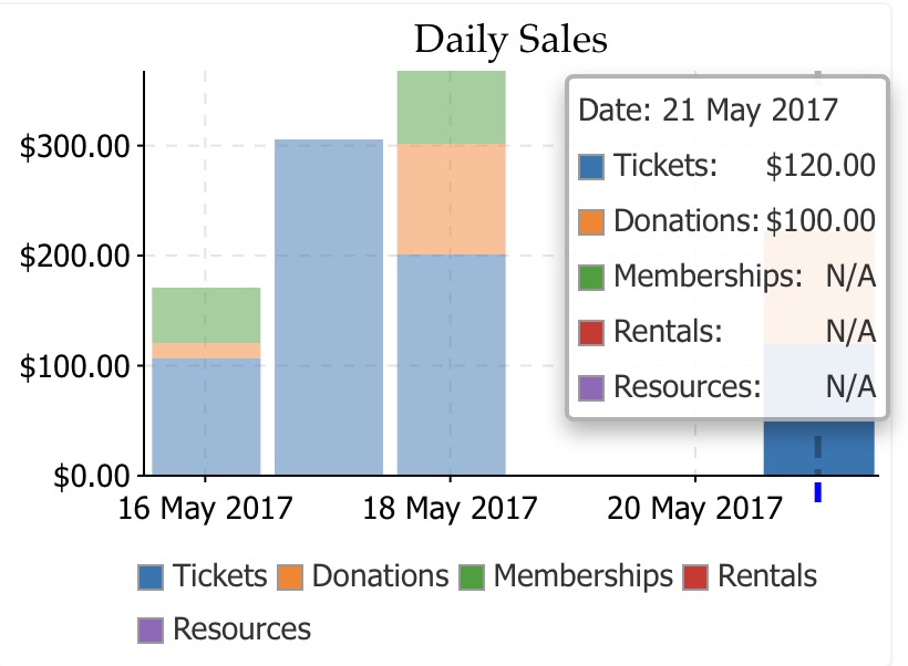
- If you click on a specific data point on a chart, a menu will popup with the current values in that part of the chart. On the bar chart below, the last column was clicked showing the actual values of each part of the column chart. Even the current values of a chart will change as new data is added.