Reveal Dashboards
| Reveal is the Theatre Manager web application that provides insights into your sales data and operations using graphical dashboard widgets.
|
|
Prerequisites for using Reveal
 Reveal requires the following in order to be used:
- Web Sales set up and running for your venue with an external domain pointing to it like tickets.yourvenue.org. It will require:
- That you are using TM Server Nginx Setup for the main web server. Apache will not work and those computers will need migrated to TM Server.
- some configuration of the Director, depending on your current TM Server setup - to get live charts.
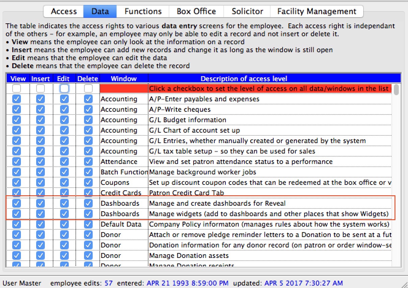
- An employee account set up in Theatre Manager with:
- employee permission to use the REST api
- employee data permission to:
- manage and create dashboards.
- manage widgets -AND-
- permission to look at the data that the graph displays. EG: if the graph shows donation data, the employee must be able to see donation data, otherwise you might get an error like not authorized to view this chart
- Note: Master users should have the above permissions automatically. You only need to provide explicit permission for Normal Users
- a primary email address:
- set up for the employee in the employee's contact card AND
- demonstrated the ability to login to the online web store using it since the same email address and password are used to access Reveal dashboards
- A recent version of a browser like Safari, Firefox, Chrome, Opera or Edge that supports PCI defined 'high encryption' (essentially TLS 1.2 or later).
This includes
- Most operating systems, tablets and smart phones with recent enough browsers.
- It has been tested on:
- Windows XP using Google Chrome version 49
- Windows 7 or later using IE 11+, Edge 14+, Chrome 58+, Firefox 53+ or Opera 45+
- OSX 10.6.8 to 10.8.5 using Firefox ESR 45 release or some other versions of Chrome or Firefox. Safari will not work
- OSX 10.9 or later with Safari 7.1+, Chrome 58+, Firefox 53+ or Opera 45+
- iOS 10 (iphone or iPad)
- Recent Android devices should work
This excludes:
- Safari on OSX 10.8.5 or earlier - please upgrade OSX (its free) or use one of the other browsers
- IE10 or earlier - Use one of the other browsers, upgrade to Edge, or upgrade your OS
- Older tablets or smart phones with older browsers
Initial Set up of TM Server port forwarding
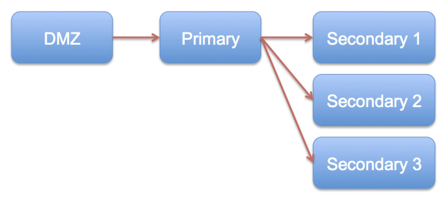
You may need to make some changes to your TM Server setup to see graphs, especially if you want to see the graphs change in real time as tickets are sold or donations are entered. AMS can help make the changes for you. What needs to happen depends on your setup per the diagram to the right.
- DMZ and Primary Listener only
- DMZ, Primary and Secondary Listener(s)
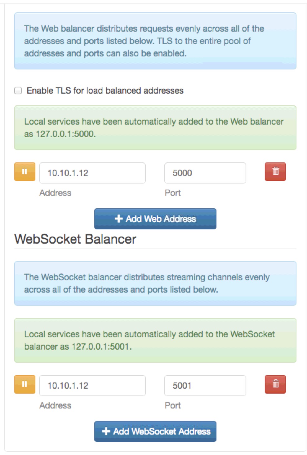
Venues with only DMZ and Primary Listener
We assume that your DMZ setup points to your Primary server using Port 443 with TLS enabled. If this is the case, all you need to do is:
- Access the machine in the DMZ
- start a recent era browser like Chrome, Safari, Firefox or Edge
- type http://127.0.0.1:3012 to see the Director
- Click on the Configure tab
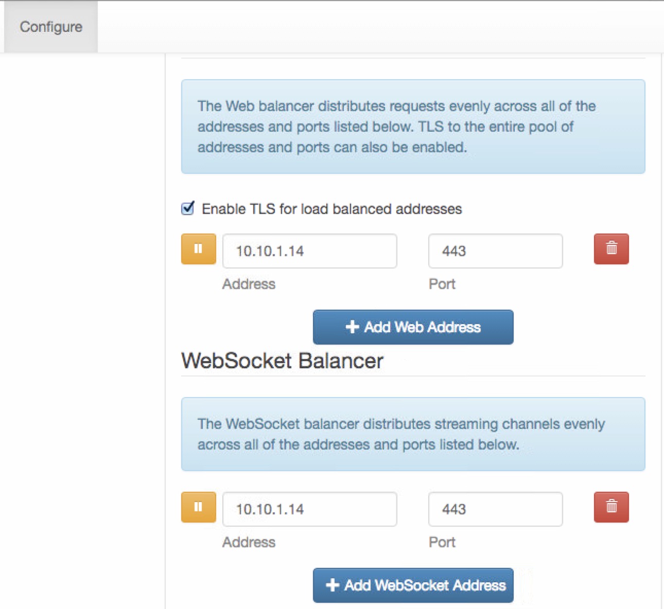
- Scroll down and look for the load balanced addresses (probably lower and left side of the web page
- If there is no 'WebSocketBalancer" address
- Click on the + Add Web Socket Address
- Type the address of the primary listener which should be the same as the 'Load Balanced Address' above
- Enter port 443 (or the same port as the'Load Balanced address'
- Click the Save button
Venues with only DMZ, Primary and one or more Secondary
- Access the Primary Listener machine
- start a recent era browser like Chrome, Safari, Firefox or Edge
- type http://127.0.0.1:3012 to see the Director
- Click on the Configure tab
- Scroll down and look for the load balanced addresses (probably lower and left side of the web page
- If there is no 'WebSocketBalancer" address
- Click on the + Add Web Socket Address
- Type the address of secondary listener #1 which should be the same as the 'Load Balanced Address' above
- Enter port 5001 - which is a special port used by the web socket load balancer
- Click the Save button
- Repeat the above for each of the secondary listeners you have.
Connecting/Using Reveal
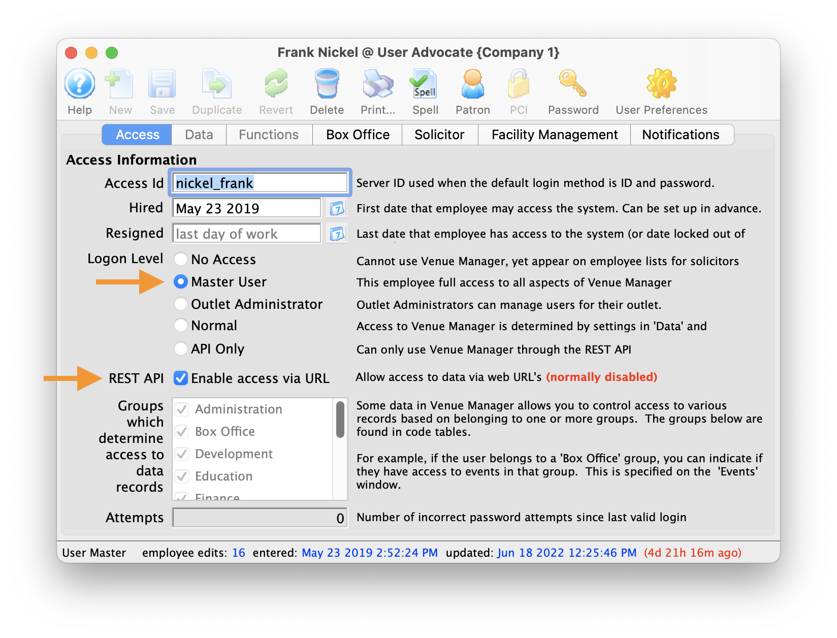 To begin, make sure the Employee Record (Setup -> Users & Access -> Employee List -> Employee) has both Access & Data permissions (or is a Master User), and that the REST API "Enable Access via URL" is enabled."
Connecting and using Reveal is quite easy. All you need to do is:
- Open a browser on any device that meets the minimum browser requirements
- Type in your ticketing url followed by /reveal.
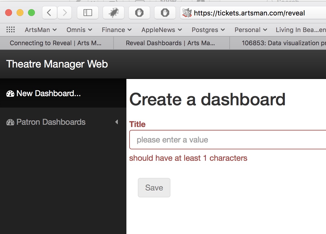
For example: the Artsman demo ticketing web site is tickets.artsman.com, so we would type the following.
https://tickets.artsman.com/reveal
Your web site is different, so type what takes you to your own ticketing web site.
- You will see a login screen in your browser like the one to the right.
- Enter the same email and password that you use to buy tickets online
- ;patron=xx if you have multiple patrons in your household that share the same email. xx is the patron number you want to log in as.
- ;outlet=yy if you are an employee that can log into multiple outlets. yy is the outlet number you want to run reveal for.
- make sure your email address is NOT shared amongst household members (eg use your company email)
- Have a different email for each outlet login
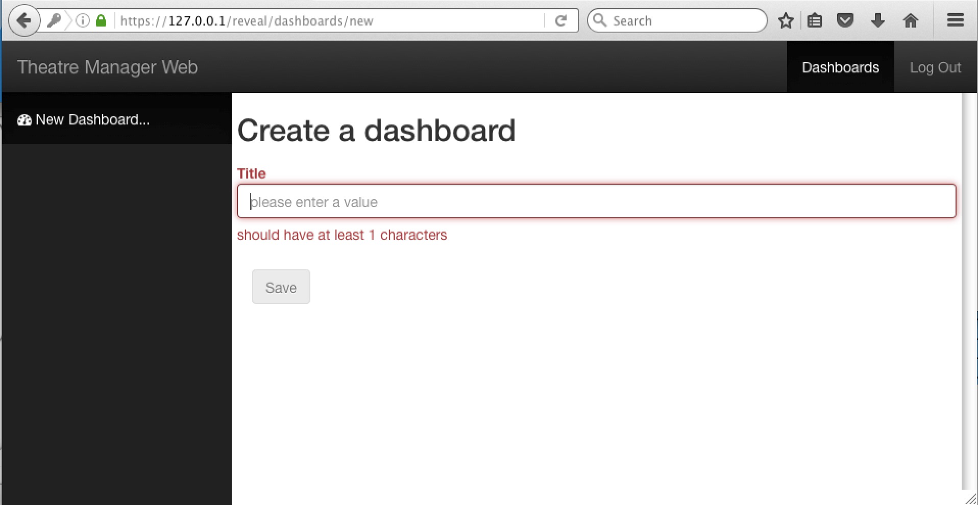
- After logging in, you will see an empty dashboard like the one below. You can then follow the steps for making dashboard containers
- Bookmark Reveal in your browser for easier access later on
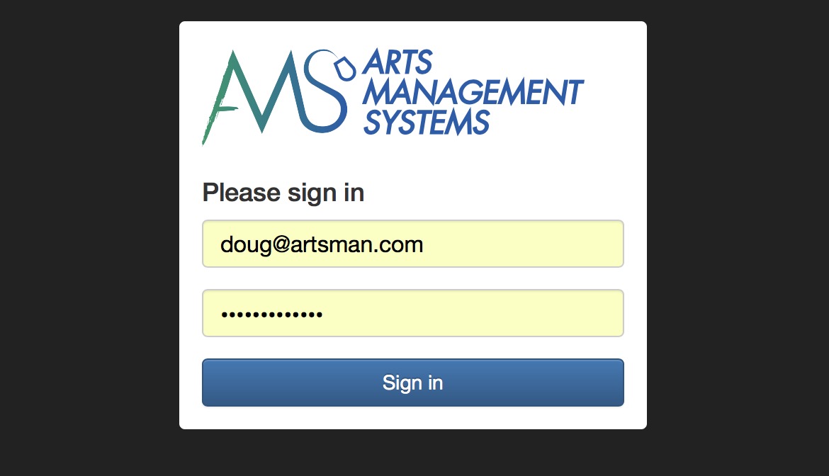
eg: doug@artsman.com
 |
If you are receiving an invalid password message when attempting to log in, make sure that you're using the same login email and password that you use to buy tickets online rather than the Theatre Manager application login password. |
 |
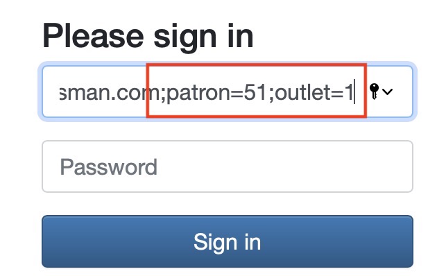 You can normally just enter your email address to login.
However, you may find you need to add one or both parameters below after your email address: doug@artsman.com;patron=xx;outlet=yy |
|
The simplest situation is to:
|
Initial dashboard with no containers
Making a dashboard container
- Weekly Sales
- Donations
- My summary
- etc.
The steps to make a dashboard container are:
- Click New Dashboard on the left side of the web page and the web page will show a dialog as below
- Type in the name of your dashboard container. Suggested names are things like 'weekly sales' or 'donations' etc.
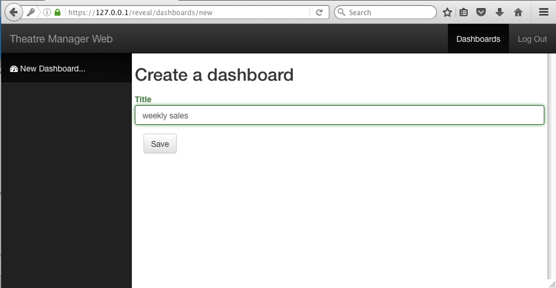
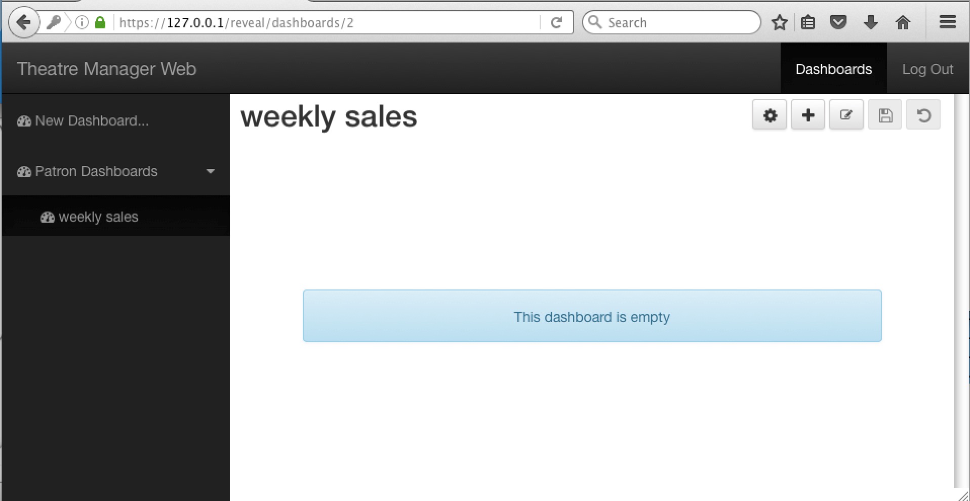
- Click the Save button and the dashboard container will appear on the left of the screen.
It will show that there are no widgets in the container, so you can begin adding widgets.
You can add as many dashboard containers as you wish, now, or later on. Currently, you cannot delete a dashboard container.
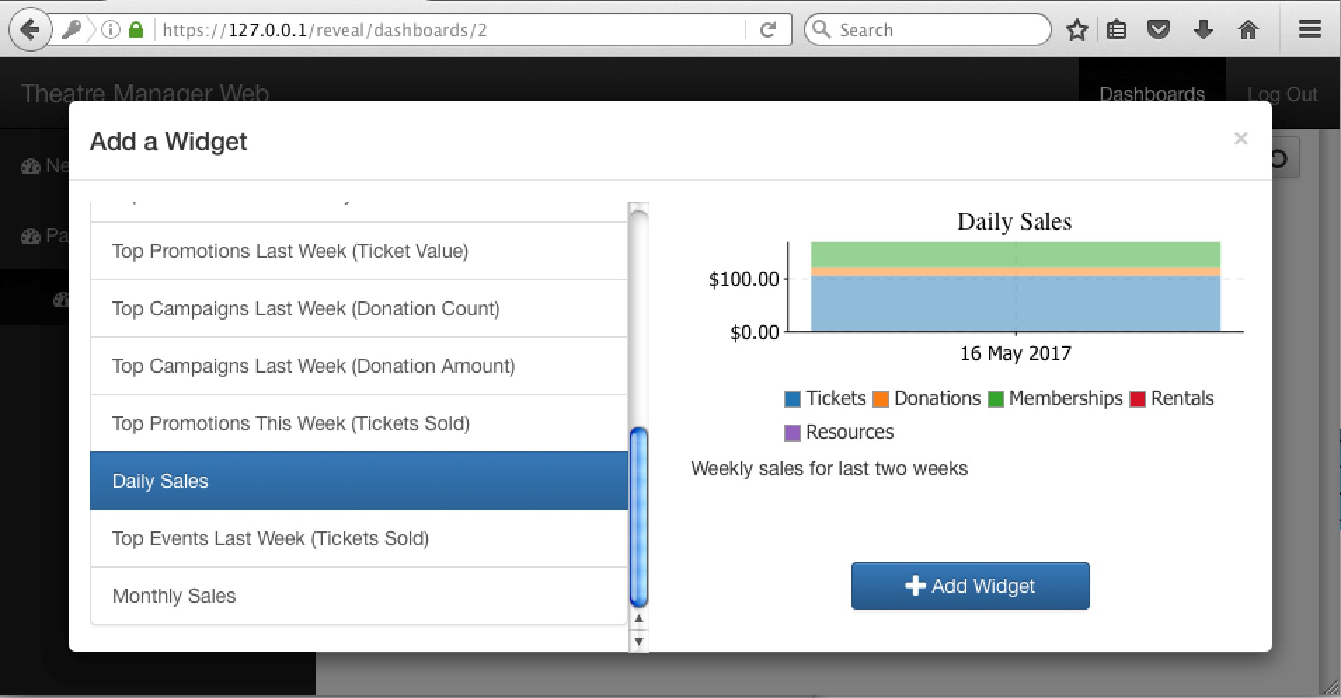
Adding a widget to a Dashboard Container
-
Pick the dashboard container that you want to add the widget to
Click the '+' icon in the upper right
-
You will be presented with a list of existing widgets to select from. Scroll down the list and pick something of interest. A live preview shows you what the graph currently looks like, based on data from your database.
Click Add Widget
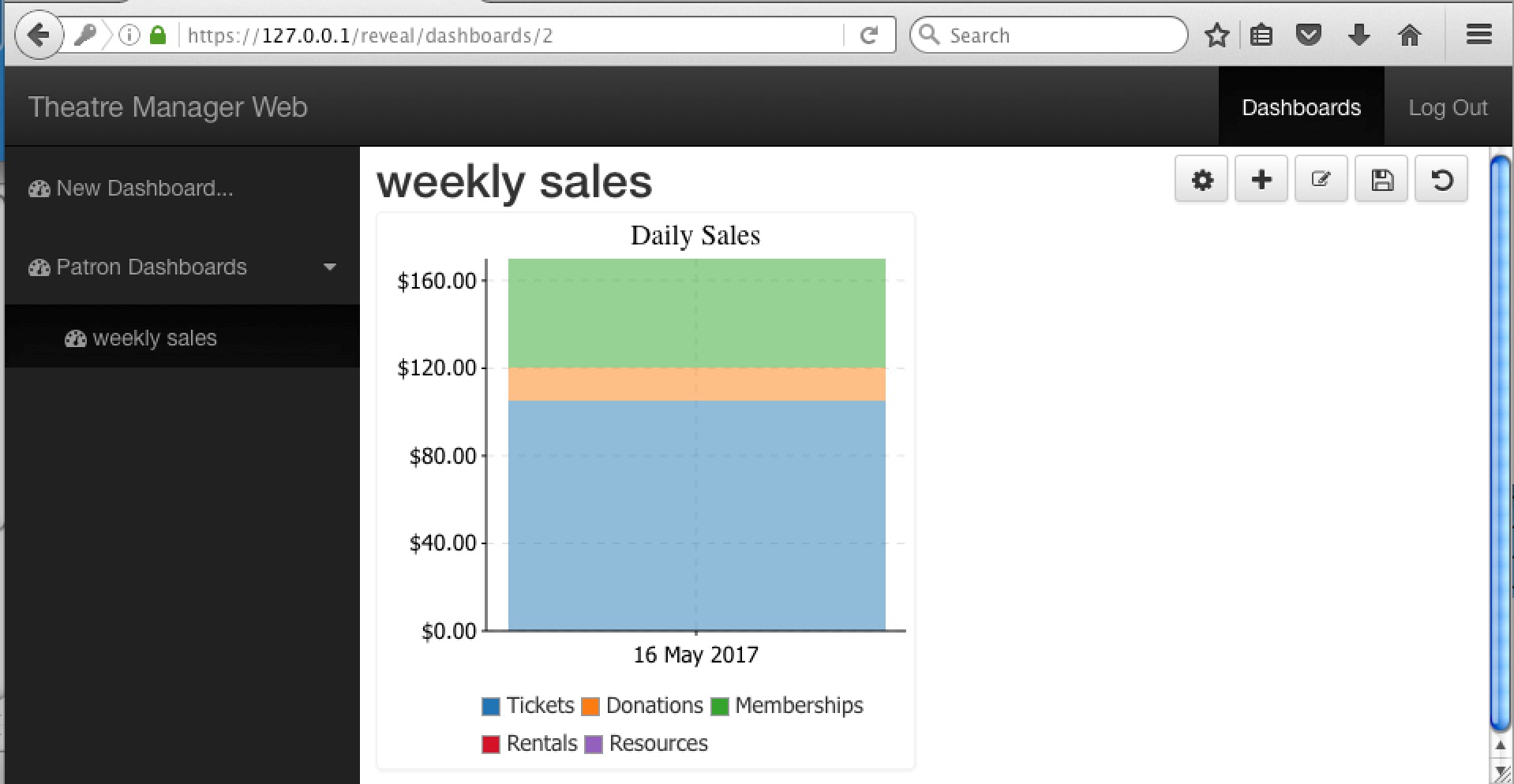
- You will see the widget added to the dashboard as per below.
NOTE, it is not yet saved or permanent.
If you like the widget that is now in the dashboard, click the Save icon on the upper right (looks like a diskette) to make the dashboard changes permanent. You must also do this if you rearrange your dashboard settings or preferences.
Adjusting width of widget in the dashboard
Adjusting Number of Widgets across the page
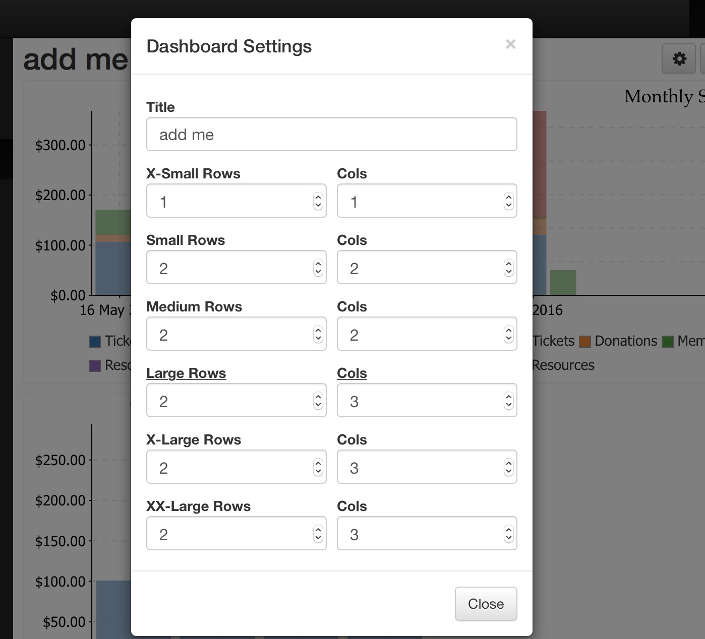
You can adjust the number of dashboard widgets that will go across the page.
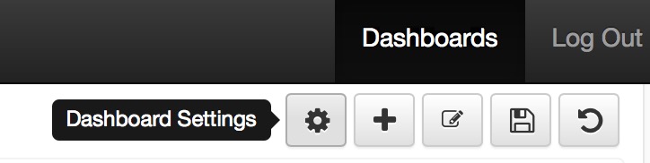
- Since Reveal is built using responsive pages and will display on any device, you can set the number and width of items by clicking on the 'dashboard settings icon'.
-
When you do that, you'll get a window that shows the number of rows and columns that charts will take up for various device widths. For example:
- a small device using X-Small rows will show one graph in a column
- a browser oriented with large rows (underlined to indicate the current device) will show the graph at twice height and 3 columns of charts
|
You can also rename the dashboard at the top of this dialog. |
Wider or Taller Graphs
- If you want wider or taller graphs, just change the row or column value as necessary. Fewer columns on larger dashboards means that the horizontal axis is stretched.
- This example show a the setting for 'large' rows where we only want to have one column of graphs. The graph expands to take up the entire row.
Edit controls on the Dashboard
- Click on the Pencil icon to start the edit process for widgets.
- Make sure to save your dashboard after making changes by clicking the diskette icon
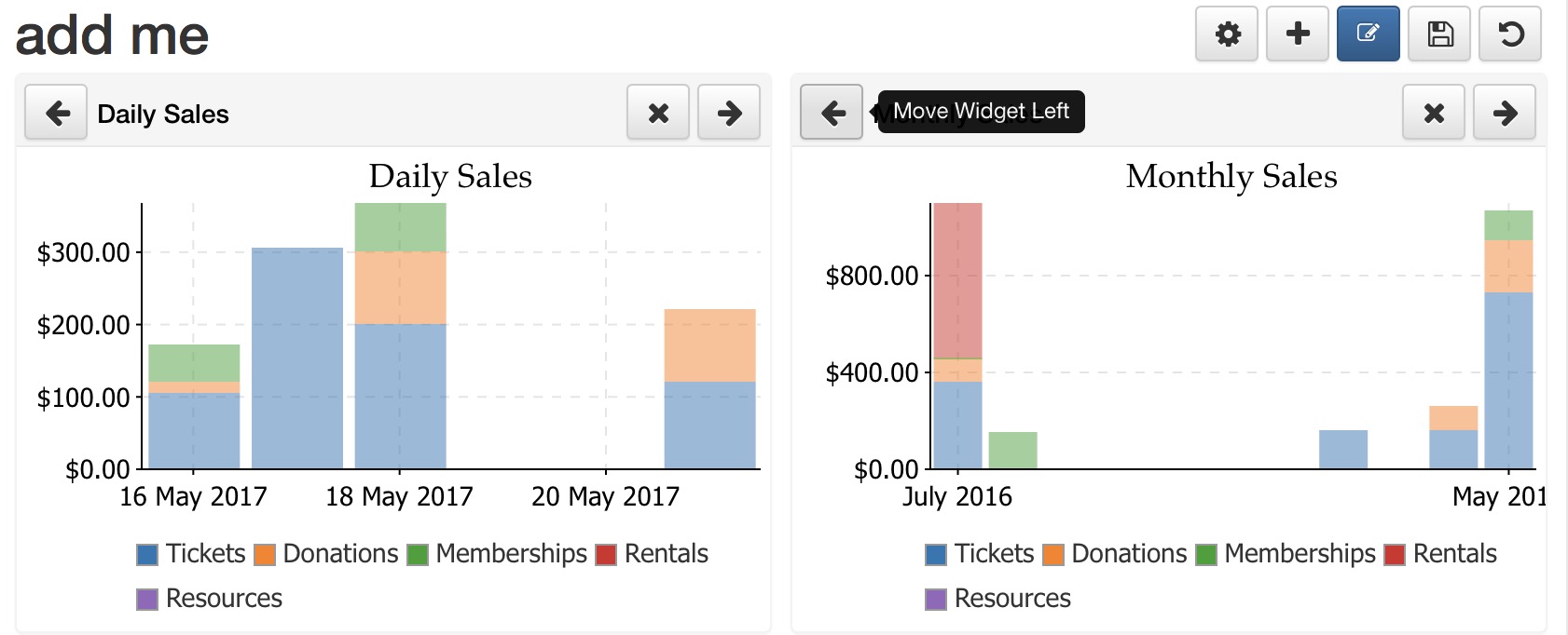
Moving a widget to the left or right
To change the position of the widget within the dashboard, click the left or right arrow to move it in on direction or the other.
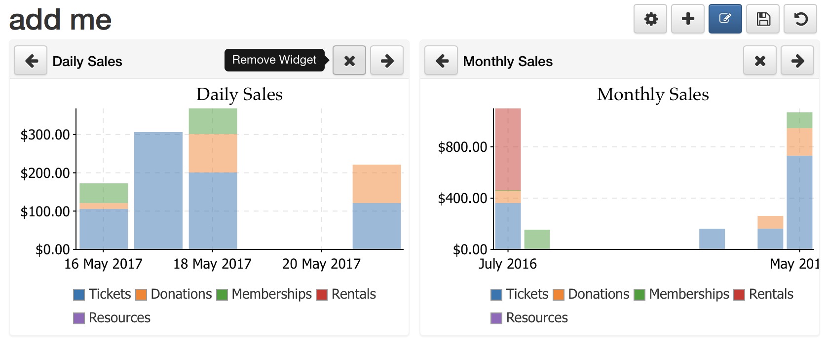
Removing a widget
To remove a widget from the dashboard, click the 'x' to remove it.
Adjusting Graphs Contents
- You can quickly eliminate some data from view by click on the legend to hide or show that part of the data - and the graph will respond accordingly
- On a number of the graphs, you might also be able to alter some criteria, such as specific events or campaigns, the title and amount of historical data. This can be used to compare two sets of data of interest
Hiding/highlighting data on a legend
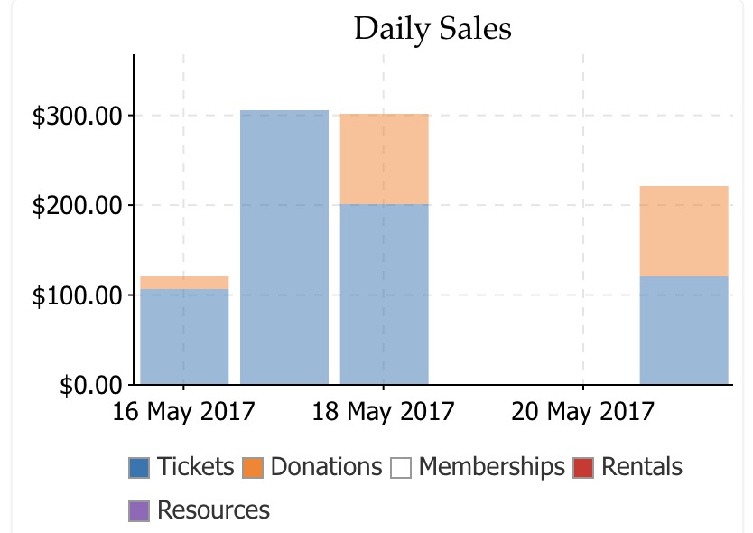
- run your mouse over the legend item to get a sense of where the data falls, with maximum and minimum. In the exanple below, the cursor is over the 'Memberships' item and it shows the relative range of data on the graph.
- Hide or show specific data on the chart. In this case, 'memberships' was clicked and all data pertaining to memberships is no longer shown on the chart. You can hide or show as many items on the graph as you want -- if you just want to see totals of some specific items.
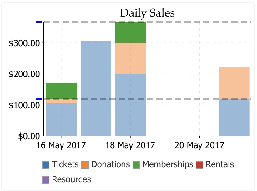
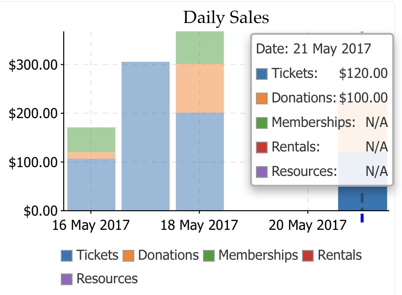
- If you click on a specific data point on a chart, a menu will popup with the current values in that part of the chart. On the bar chart below, the last column was clicked showing the actual values of each part of the column chart. Even the current values of a chart will change as new data is added.
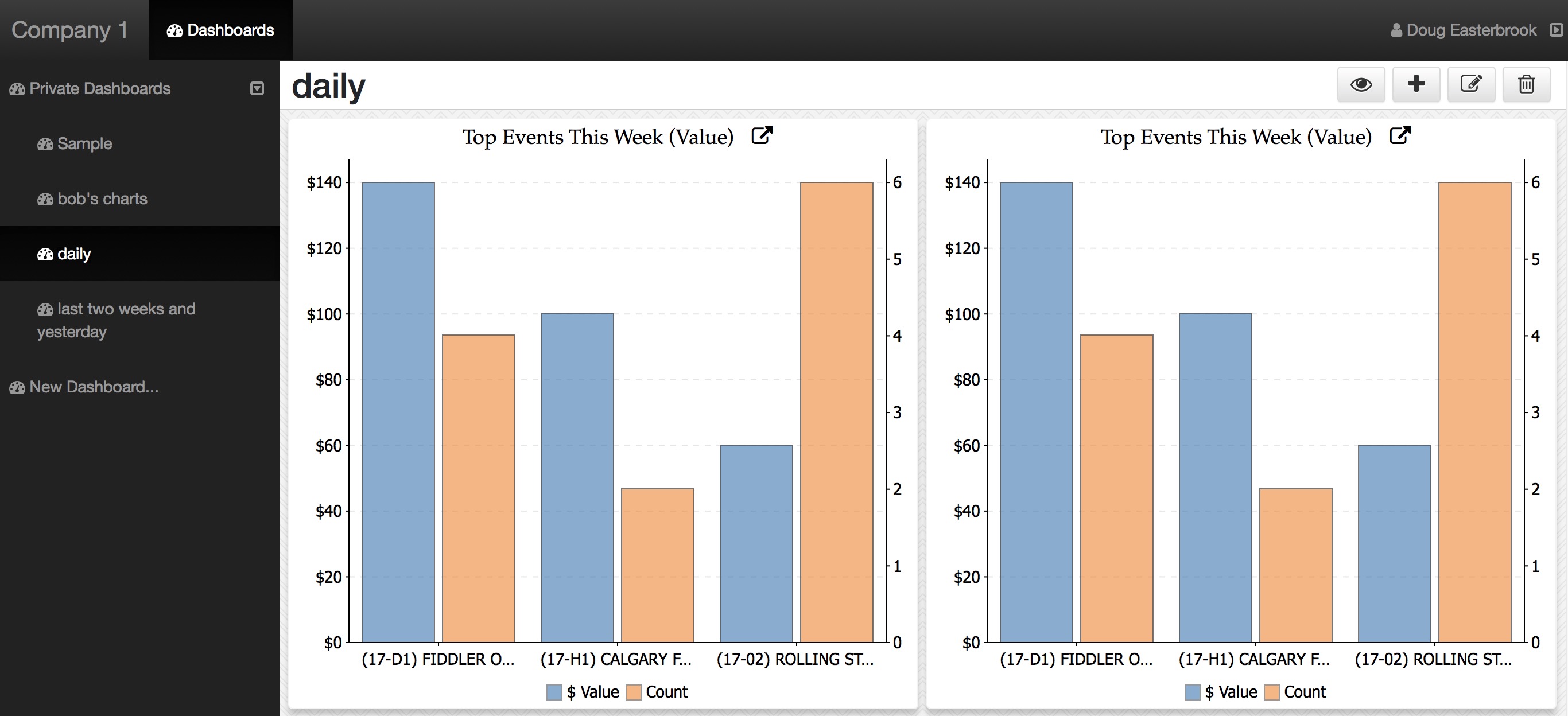
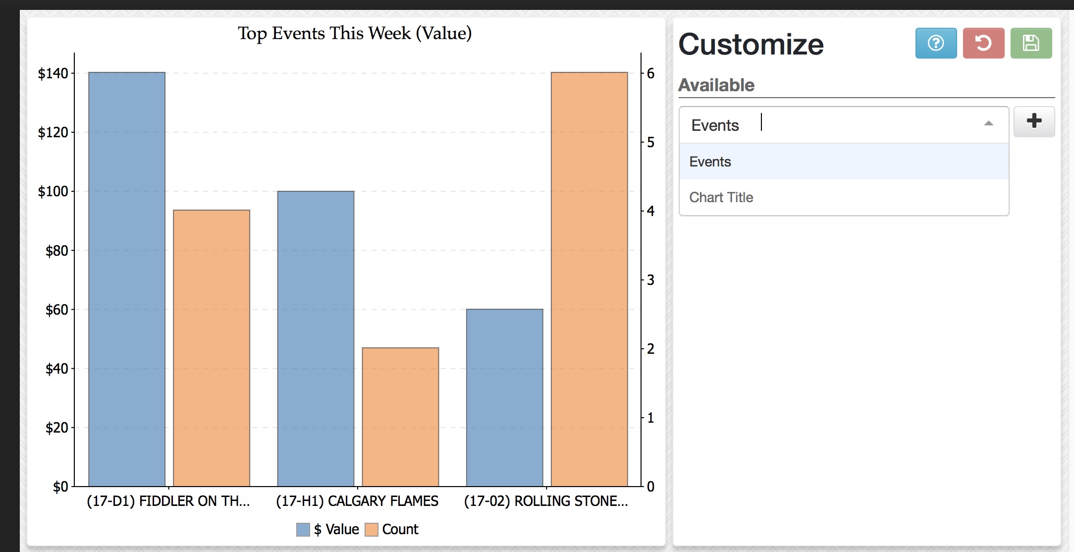
Changing parameters on Charts
- They initially show the current week revenue for the 'Top' events where tickets have been sold.
- And after editing the parameters, they show different data on the same type of graph
Before Customization
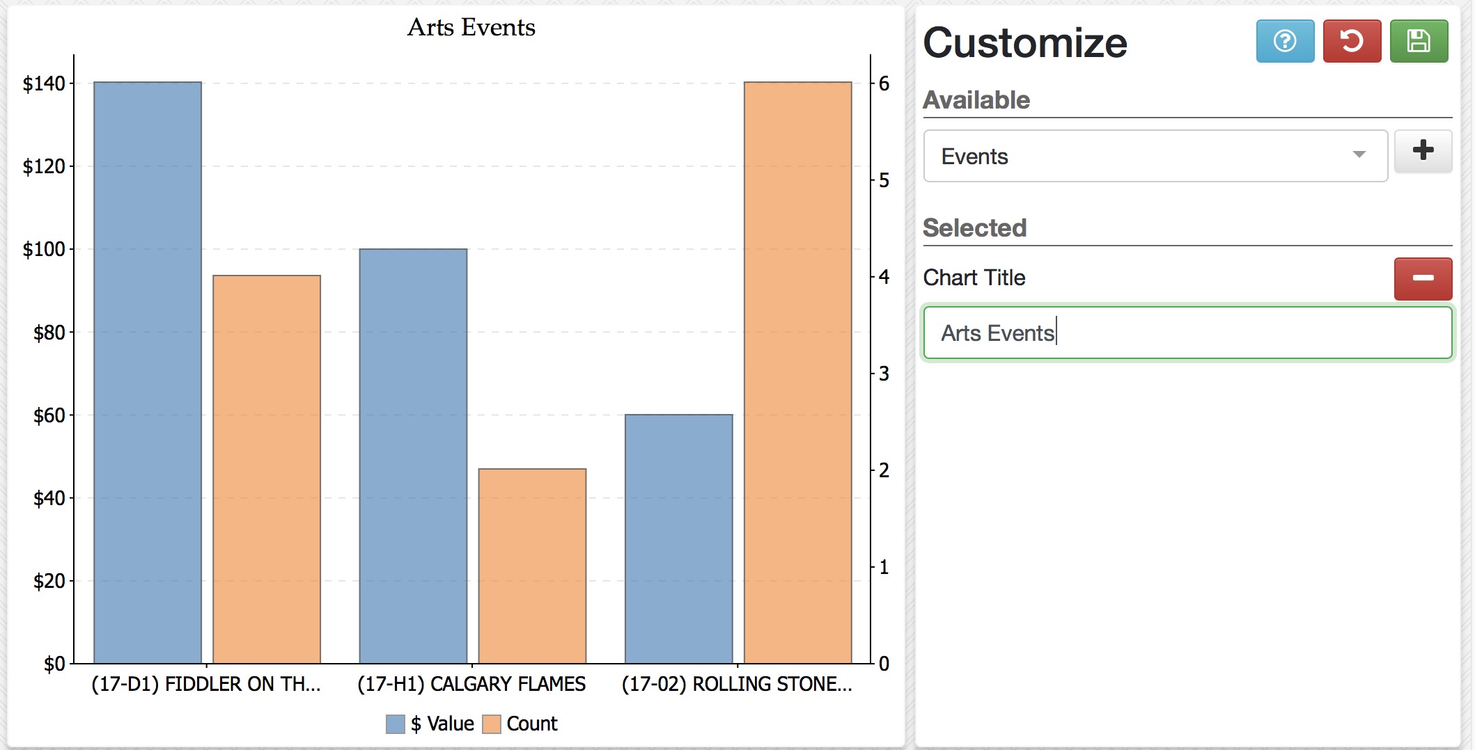
Suppose that you have two venues and want to see different event revenue, or you have some internally produced events and some that are co-produced. Or, in the case of donations, suppose you want to separate out some individual and capital funds. When a graph supports criteria, that is easy to do
- First, click the title of the chart and the parameters window appears
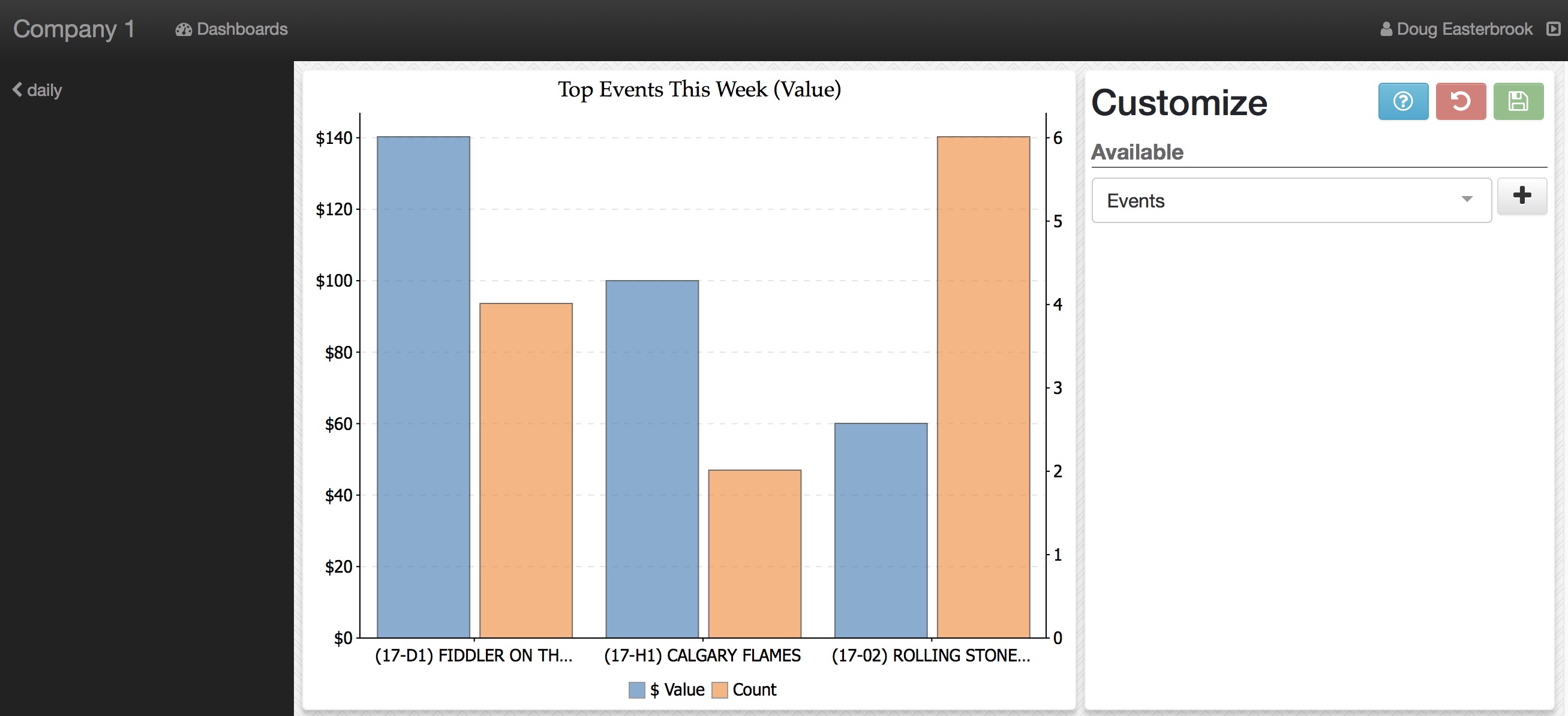
-
Click the parameter pop-up to see what things that can be changed on this graph - as each graph might have different parameters.
- In this case we see Title and Events
- click the parameter you want to change
-
In this example:
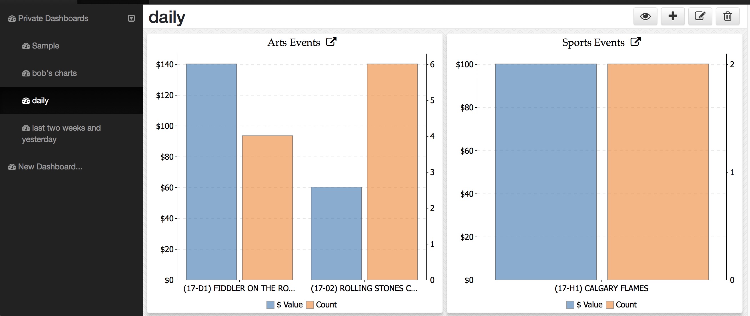
- Title was selected and it created an edit window
- The title was changed to Arts Events
- When you are finished, click the save Icon to commit the change
-
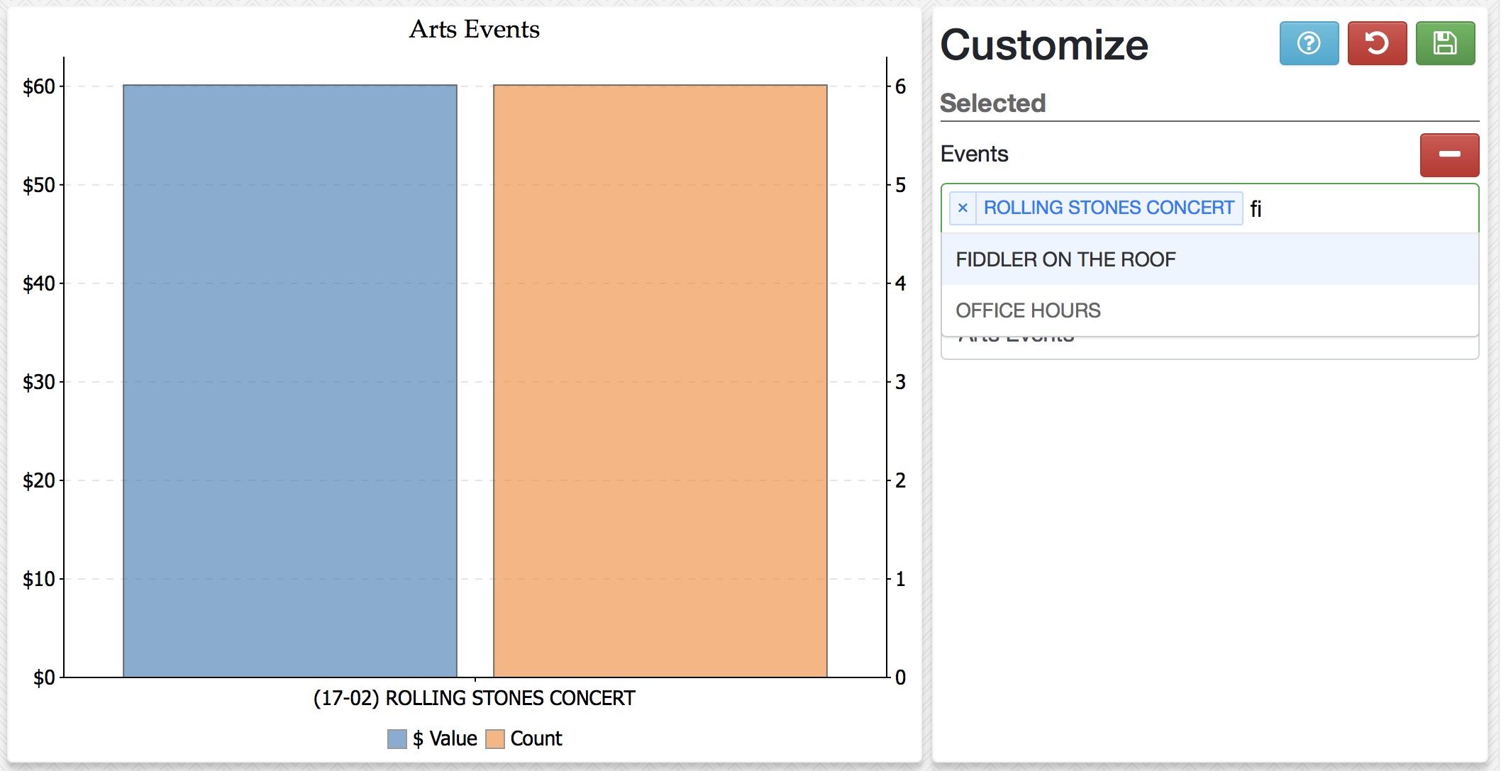
You can change one or more parameters.
- Event was added as a customized parameter
- Type part of an event in your database and it will show in the list
- Select that event to make it part of your data
- Type another event and pick it from the list
- Repeat till you have the events you want (there may be a limit to the number of items that can be placed in a pick list
- click Save when done
-
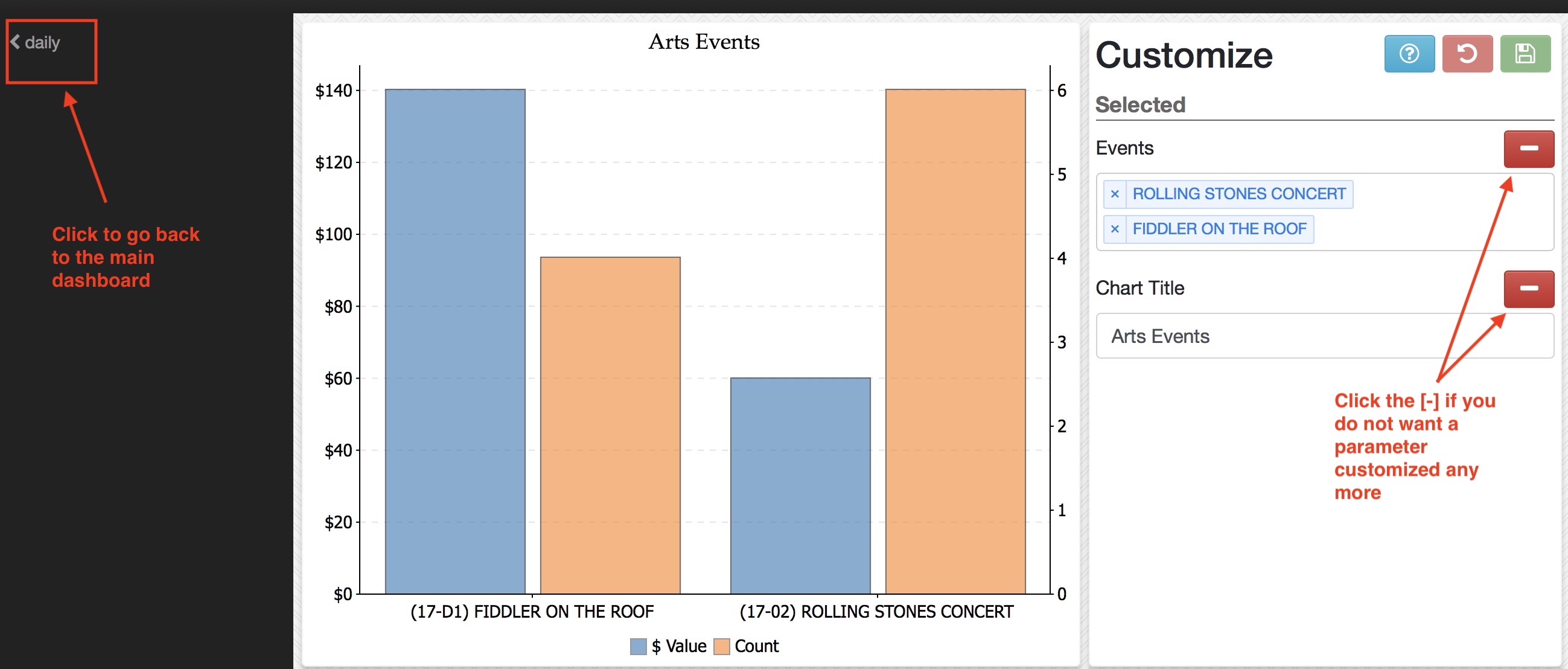
When you are done editing, you can:
- Go back to the main dashboard by clicking the arrow on the left of the image
- Click on the remove icon if you do not want to customize that part of the chart any more and resume using the defaults
A Sample of a customized dashboard
This is a final sample after customizing both graphs to show separate groups of data of interest.
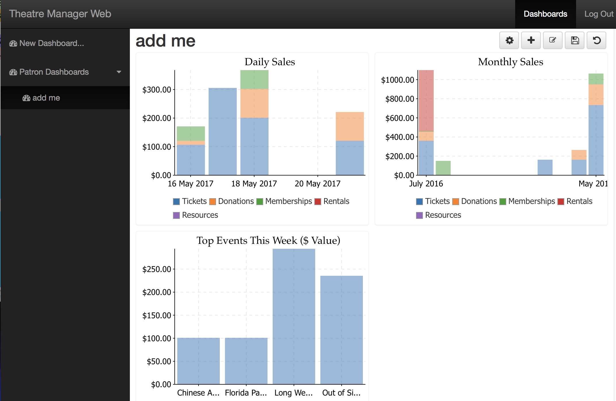
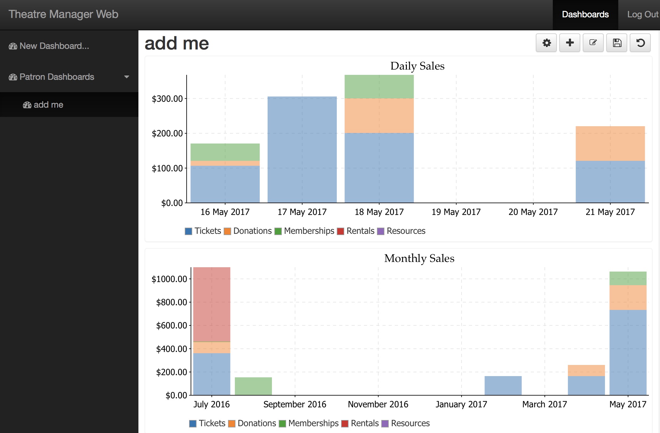
Common Reveal Errors
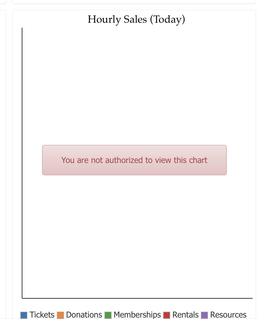
User Not Authorized
If a graph you put on your dashboard shows a message like You are not authorized to view this chart, the problem is user permissions for some of the data on the chart.
For example, if you are asking for a chart that contains data on donations and you are not allowed to view donation data -- then you could see this message.
You can allow charts to show the data if you have at least 'VIEW' permission for all of the data on the chart. In the example to the right, the chart has data from:
- Tickets
- Donations
- Memberships/passes/gift certificates
- Facility Rentals - basically inventory items
- Resources - staff assigned to orders for purposes of billing