Adjusting Graphs Contents
There are a some ways that you can alter the display of the chart.
- You can quickly eliminate some data from view by click on the legend to hide or show that part of the data - and the graph will respond accordingly
- On a number of the graphs, you might also be able to alter some criteria, such as specific events or campaigns, the title and amount of historical data. This can be used to compare two sets of data of interest
Hiding/highlighting data on a legend
Some of the charts will have legends on them. When you see those, you can:
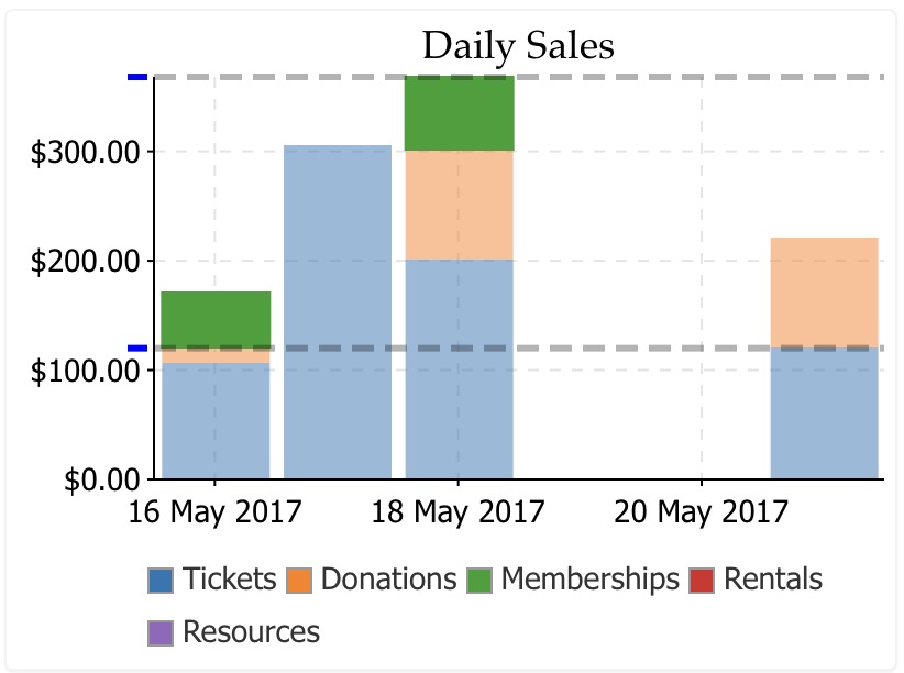
- run your mouse over the legend item to get a sense of where the data falls, with maximum and minimum. In the exanple below, the cursor is over the 'Memberships' item and it shows the relative range of data on the graph.
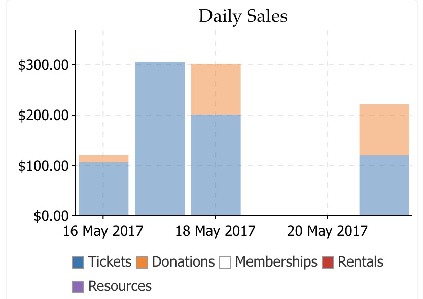
- Hide or show specific data on the chart. In this case, 'memberships' was clicked and all data pertaining to memberships is no longer shown on the chart. You can hide or show as many items on the graph as you want -- if you just want to see totals of some specific items.
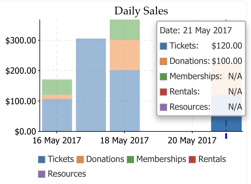
- If you click on a specific data point on a chart, a menu will popup with the current values in that part of the chart. On the bar chart below, the last column was clicked showing the actual values of each part of the column chart. Even the current values of a chart will change as new data is added.
Changing parameters on Charts
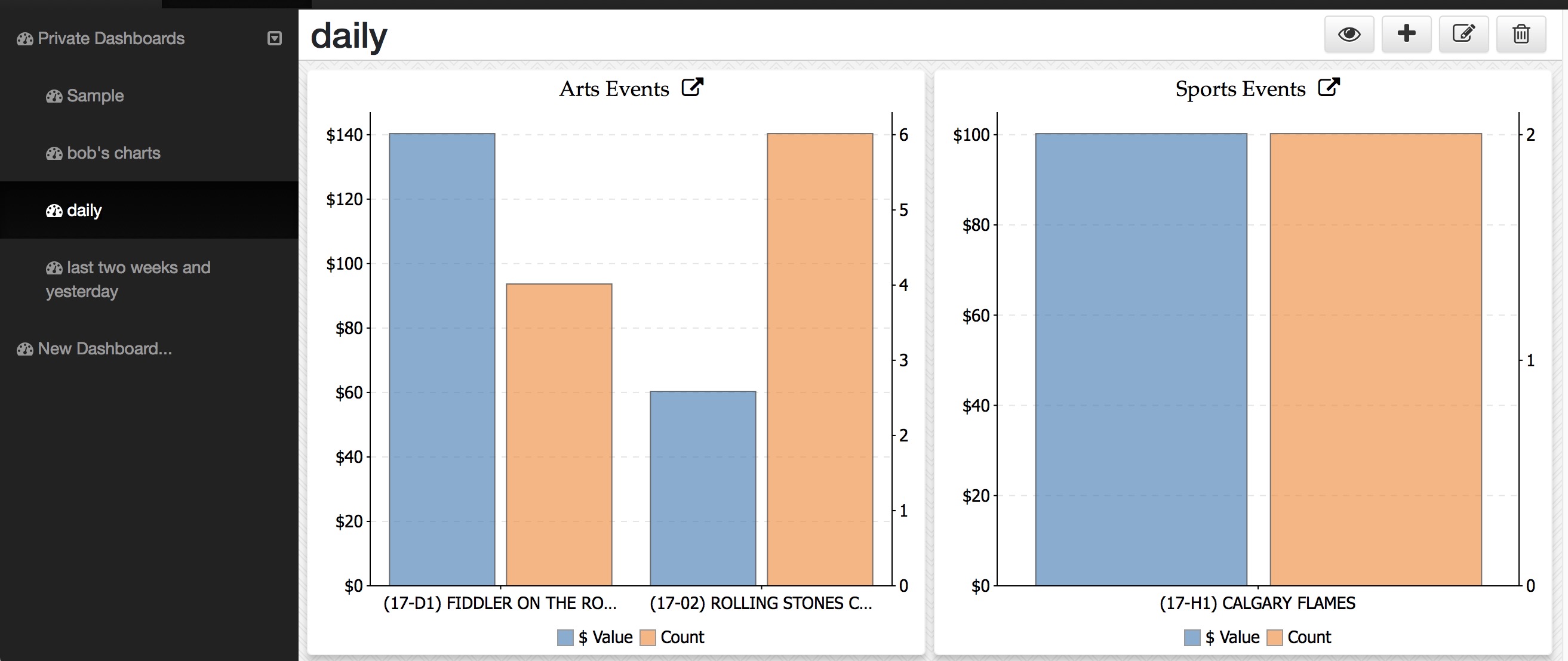
This example shows two graphs that are exactly the same.
Before Customization

- They initially show the current week revenue for the 'Top' events where tickets have been sold.
- And after editing the parameters, they show different data on the same type of graph
Before Customization
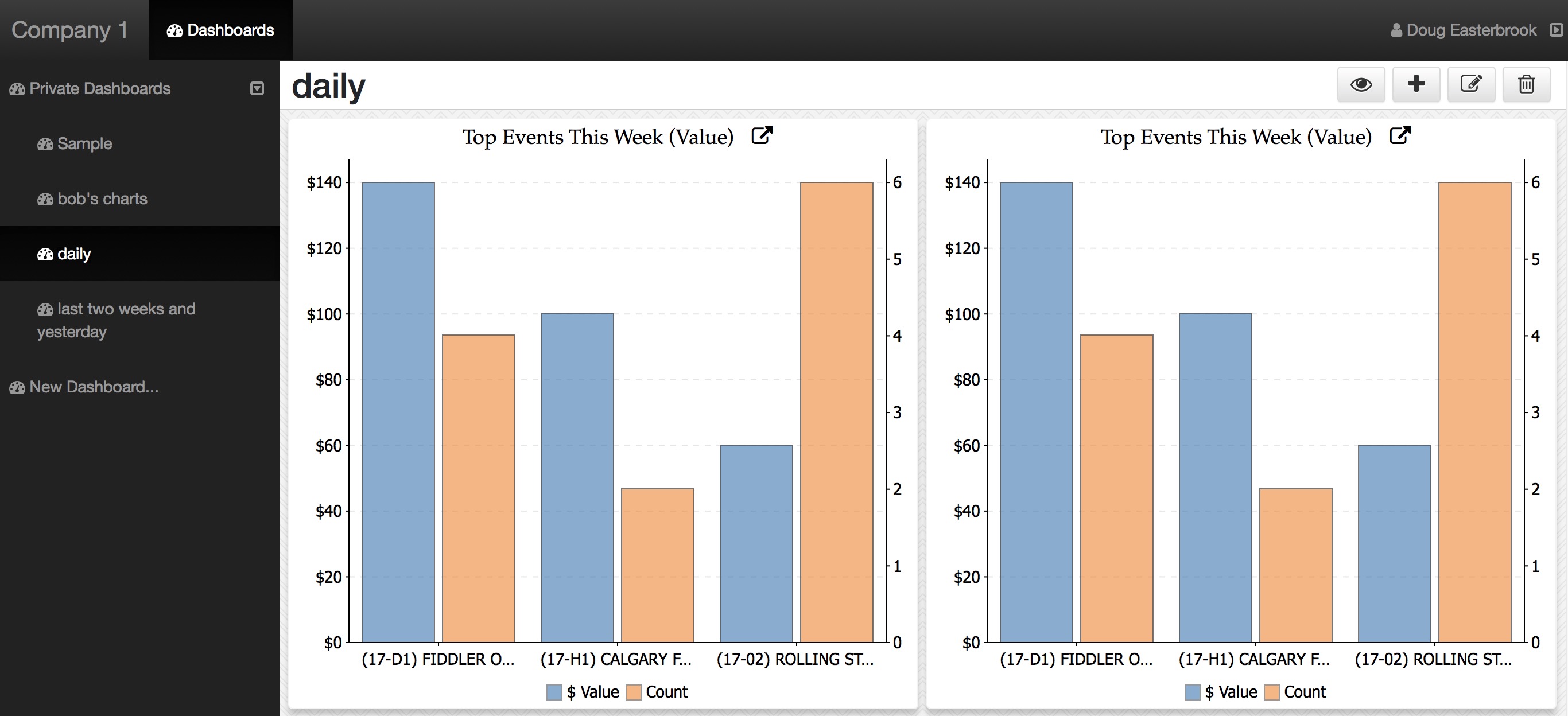
Suppose that you have two venues and want to see different event revenue, or you have some internally produced events and some that are co-produced. Or, in the case of donations, suppose you want to separate out some individual and capital funds. When a graph supports criteria, that is easy to do
- First, click the title of the chart and the parameters window appears
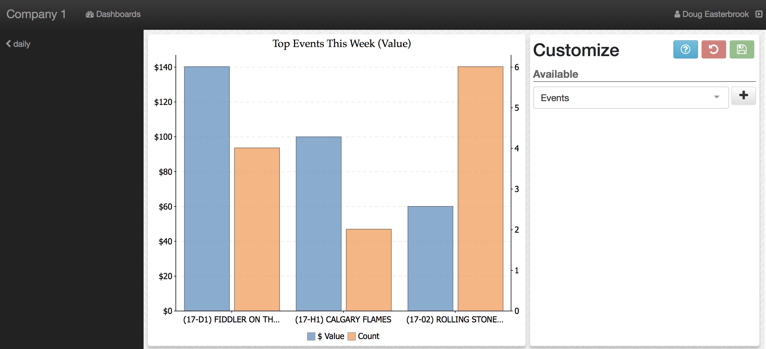
-
Click the parameter pop-up to see what things that can be changed on this graph - as each graph might have different parameters.
- In this case we see Title and Events
- click the parameter you want to change
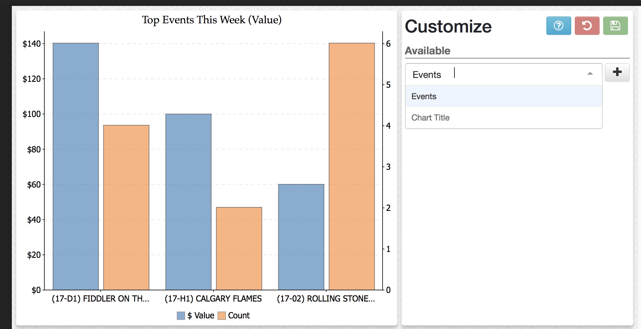
-
In this example:
- Title was selected and it created an edit window
- The title was changed to Arts Events
- When you are finished, click the save Icon to commit the change
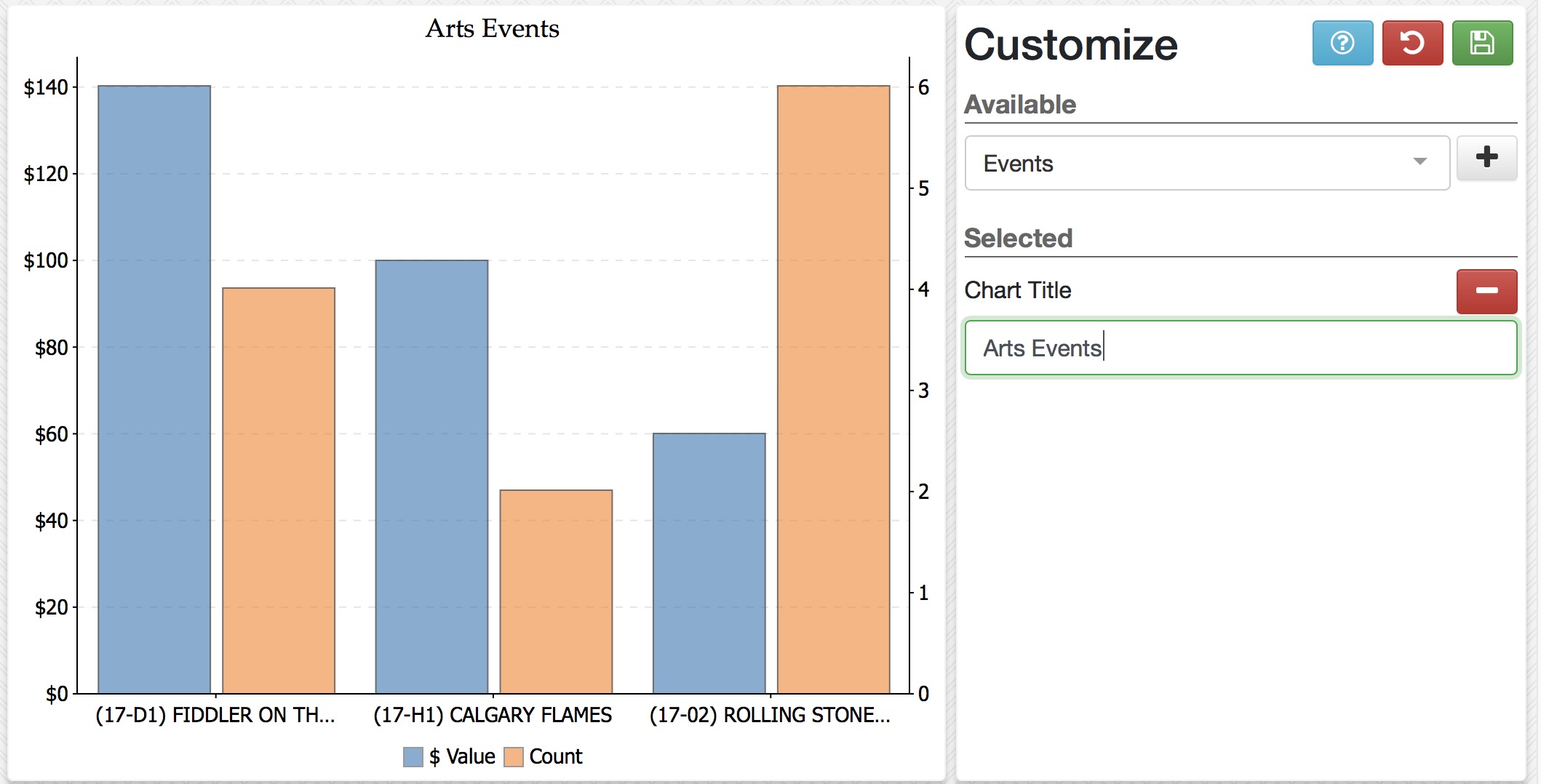
-
You can change one or more parameters.
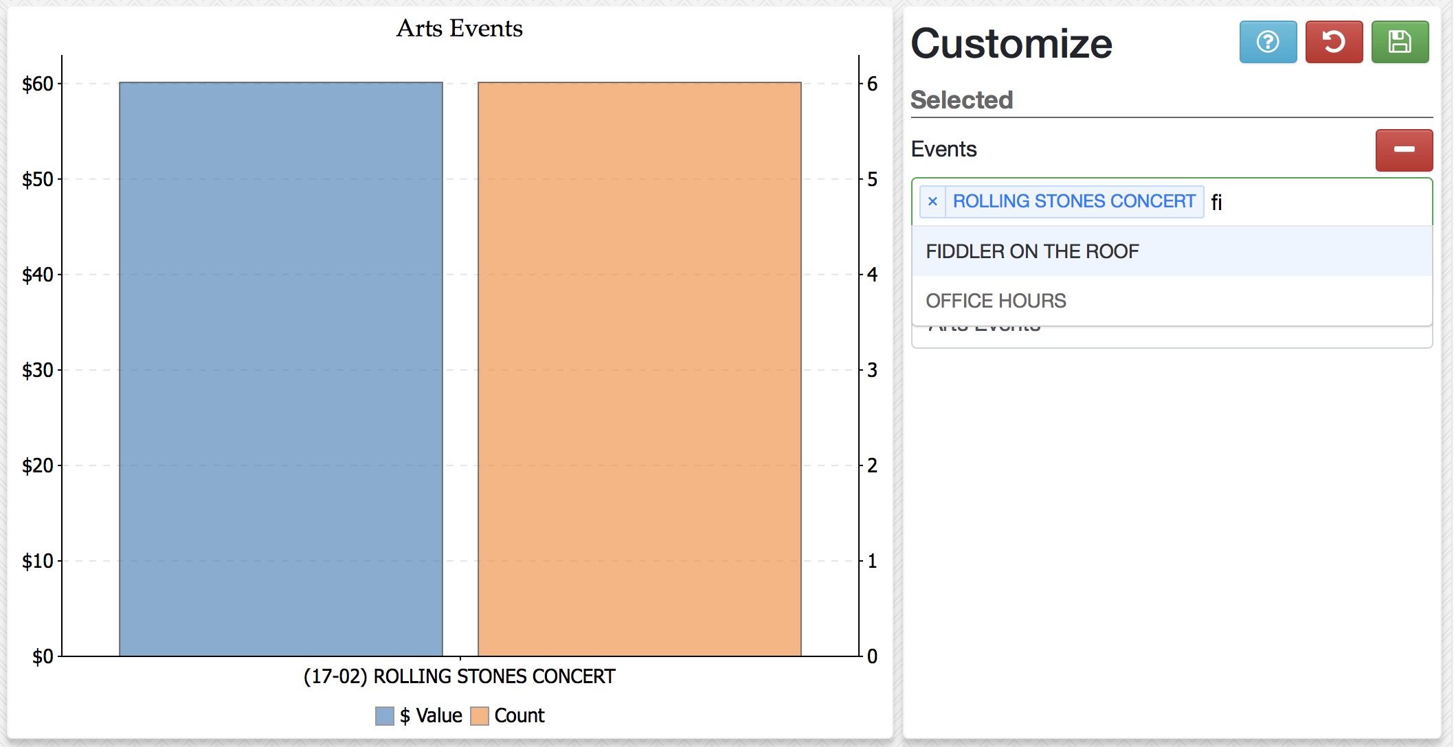
- Event was added as a customized parameter
- Type part of an event in your database and it will show in the list
- Select that event to make it part of your data
- Type another event and pick it from the list
- Repeat till you have the events you want (there may be a limit to the number of items that can be placed in a pick list
- click Save when done
-
When you are done editing, you can:
- Go back to the main dashboard by clicking the arrow on the left of the image
- Click on the remove icon if you do not want to customize that part of the chart any more and resume using the defaults
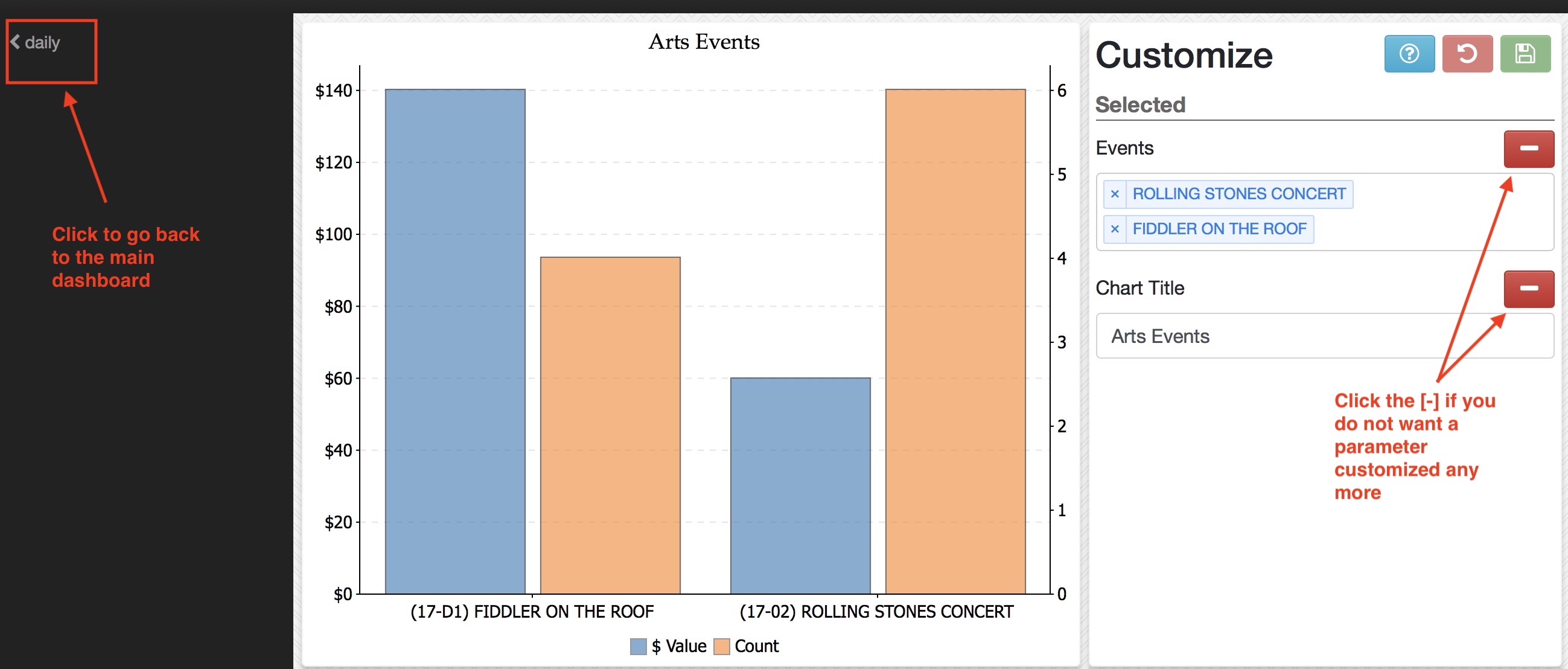
A Sample of a customized dashboard
This is a final sample after customizing both graphs to show separate groups of data of interest.
